Paguru
It was supposed to be a landing page update. It became a new website, with a new brand and three businesses to explain, in one month.
Result: Website with a new brand delivered in 1 month
- What
- New brand and landing page
- Client
- Paguru
- Role
- Product Designer
- Timeline
- 1 month
- Platform
- Web
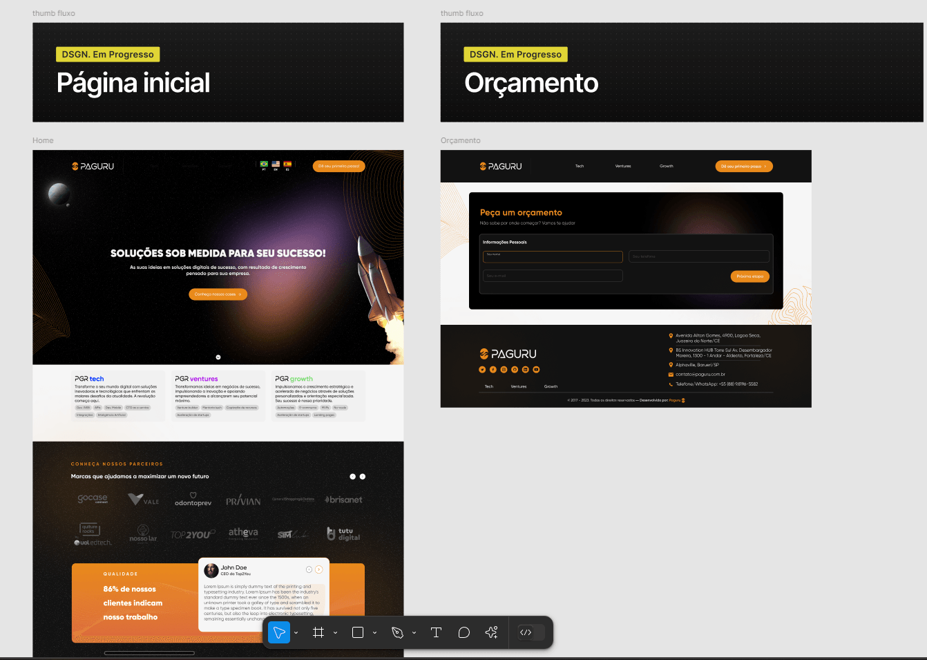
The problem
Paguru was launching a space-themed visual identity and splitting its operation into Paguru Tech, Ventures and Growth. The website had to present each business clearly, without losing its main audience: companies that hire squads.
The identity was still being finalized while the website was being designed, so the process had to absorb changes every week.
- Hero
- Convey the essence of the new brand in the first few seconds.
- Proof
- Real partners and projects as a sales argument.
- Process
- Work stages laid out to give the client transparency.
How I got there
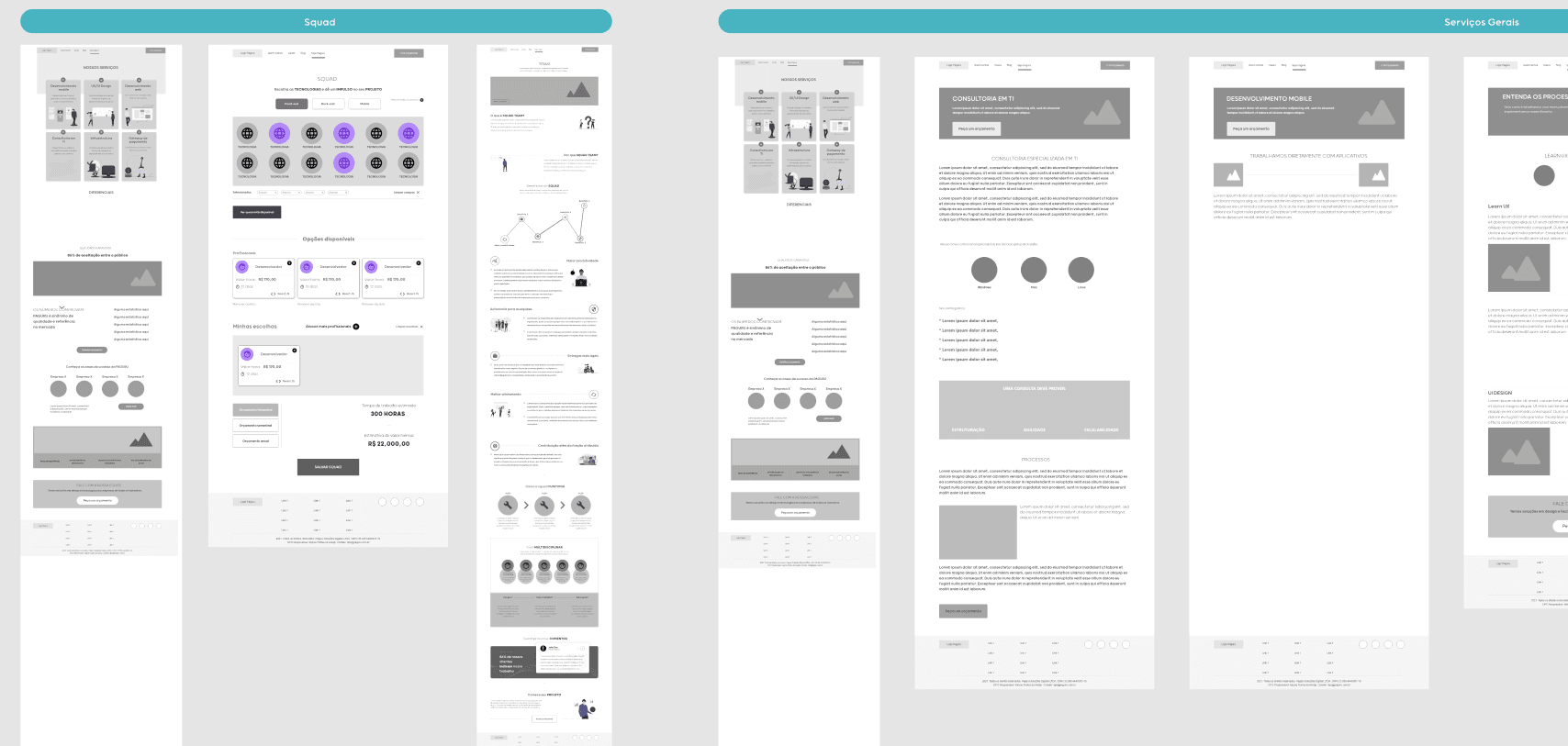
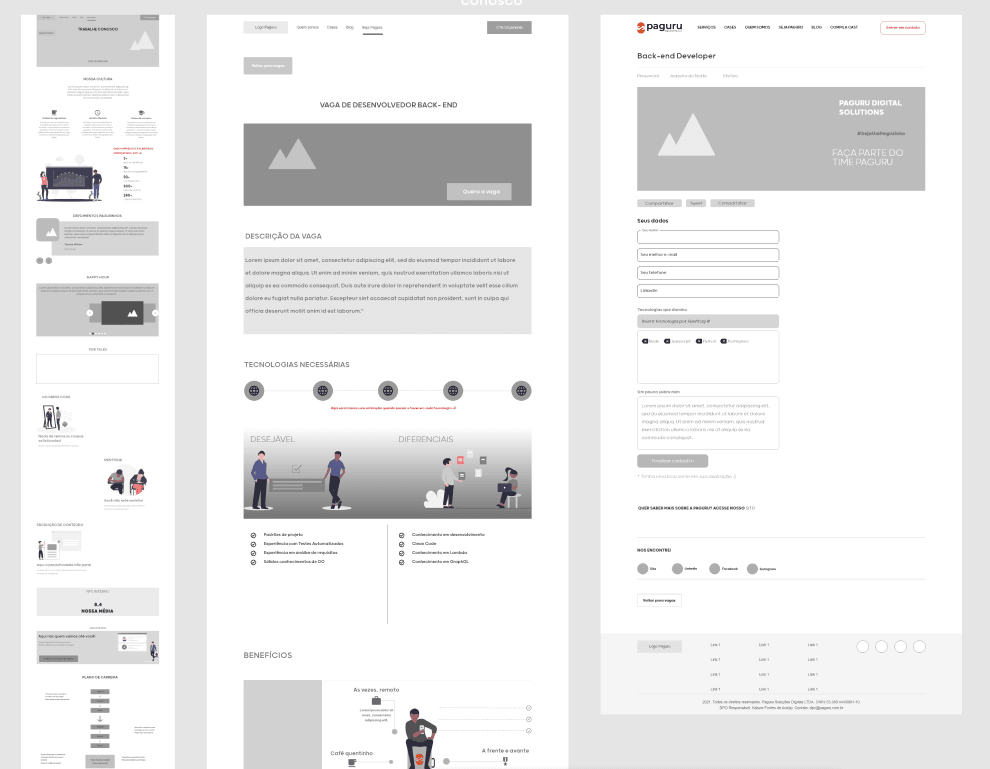
A benchmark of tech websites, Behance, Dribbble and Muzli to map navigation and hierarchy patterns. Then, paper wireframes, iterations in Figma and high-fidelity versions applying the new brand guidelines.
Short sprints and daily meetings with the Paguru team kept everything moving even with the identity changing along the way.
Result
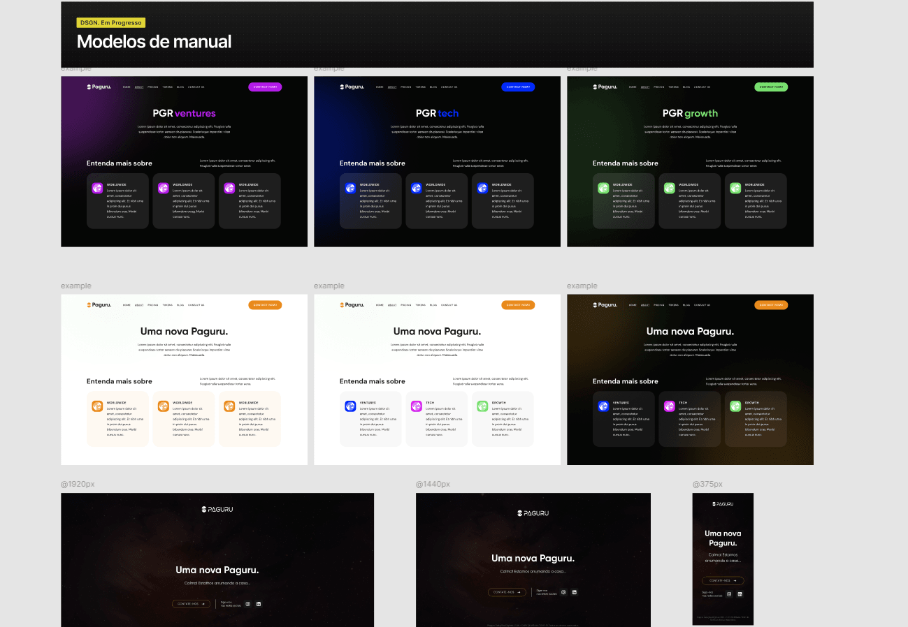
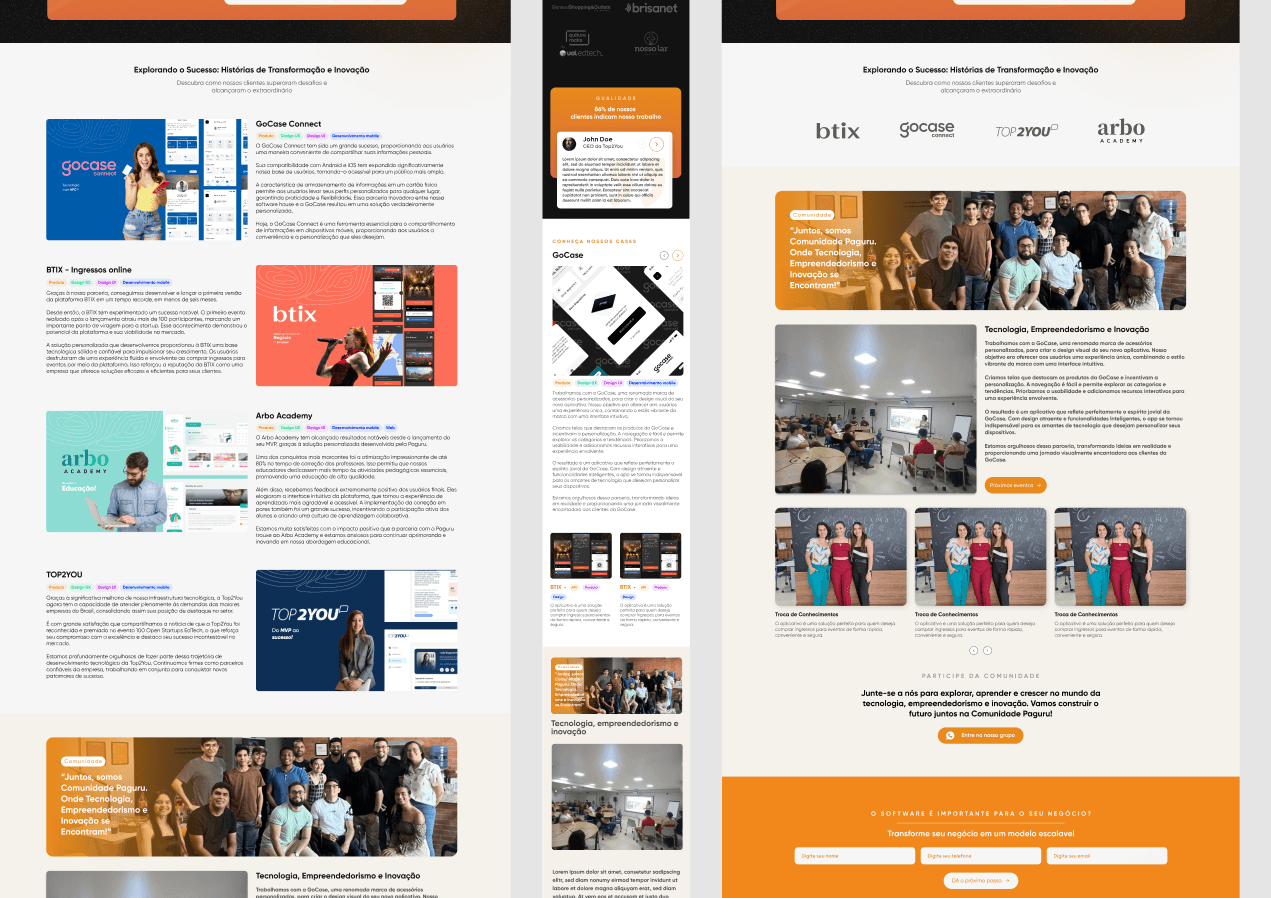
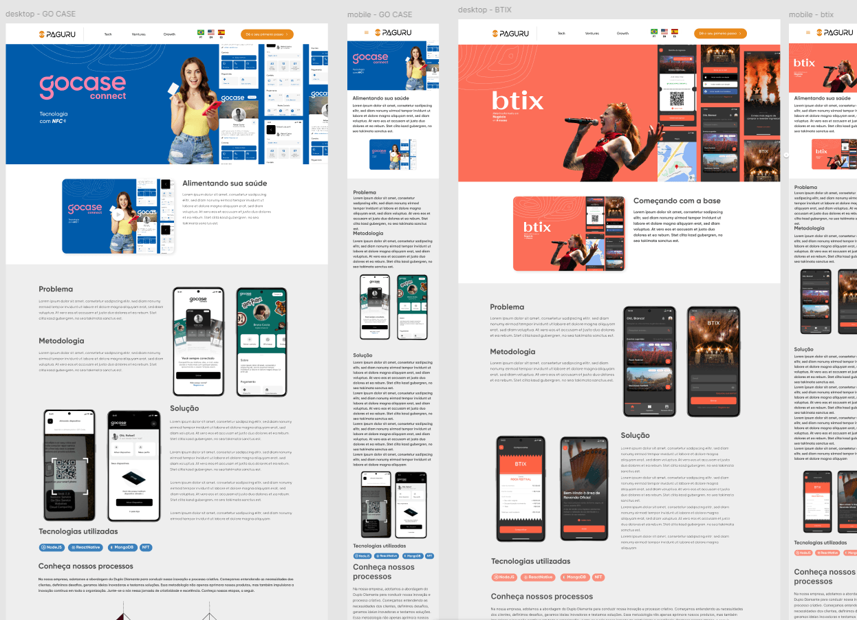
V1 was approved and published. In V2, the Growth business was removed and the Paguru community and case study details were added, without rebuilding the structure.
Delivered in one month, with the new brand applied and each business line given its own space.
Have a similar product that's stuck?